Good design is about more than aesthetics — it’s also about visual accessibility.
Our design team has compiled a list of disability-inclusive guidelines to make your designs more accessible to those with visual disabilities and impairments, including why you should be using sans serif fonts over serif, the importance of the 7:1 contrast ratio, why giant blocks of text are BAD, and more.
1. The 7:1 Contrast Ratio
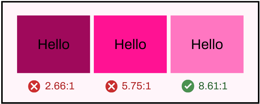
Keeping a 7:1 foreground to background (or vice versa) contrast ratio makes reading accessible for folks with visual disabilities. Double-check your work with online contrast checkers.
According to the Web Content Accessibility Guidelines at webaim.org
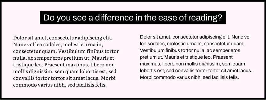
2. Use Sans Serifs When Possible
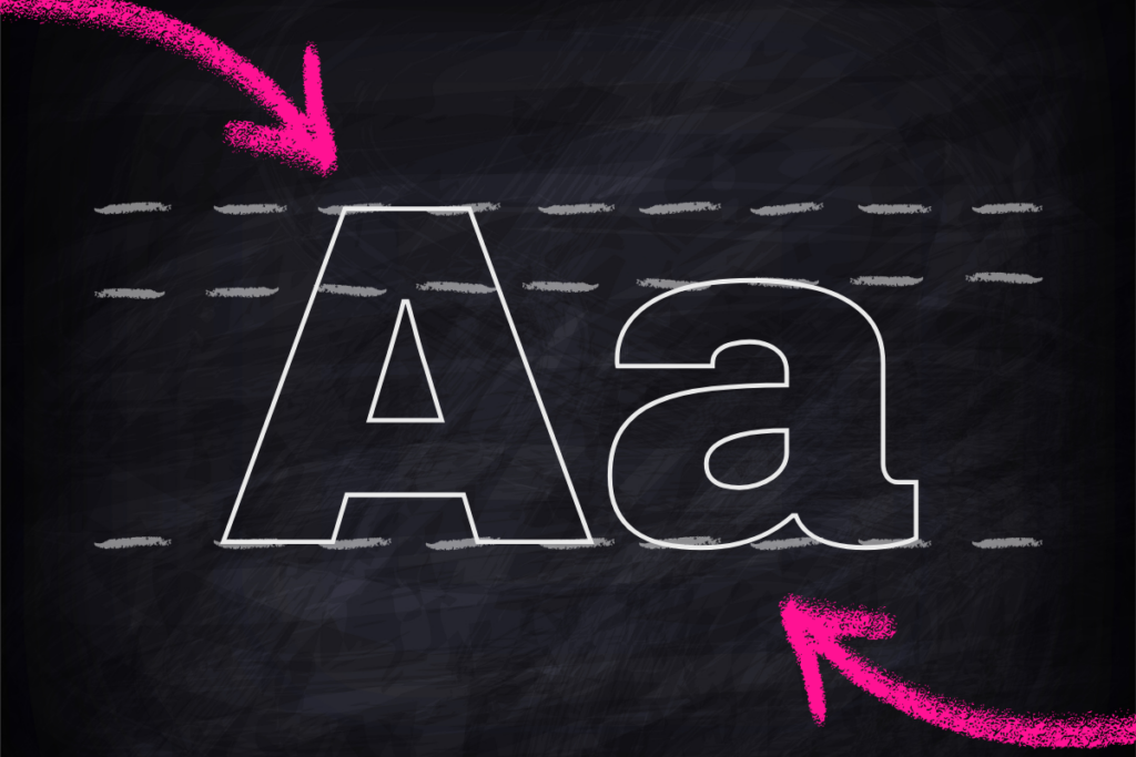
For people with good vision, serifs are slightly easier to read than sans serifs, but for those with vision disabilities, serifs significantly hinder legibility. Try to only use serifs for headers or larger text, especially for digital designs.
According to the General Services Administration at section508.gov
3. Add Subtitles to Audio and Video
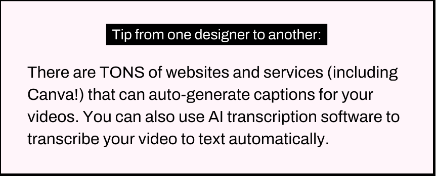
Subtitles and transcripts make time-based designs accessible to people with hearing loss or folks who don’t have a quiet space available to listen to the audio.
4. Don’t Let Readability Rely Solely on Color
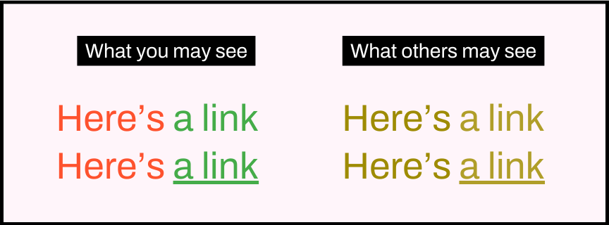
There should be other indicators like underlined hyperlinks and icons so that folks with visual disabilities like color blindness can understand the content. It will also help your work be more readable if it needs to be translated into black and white.
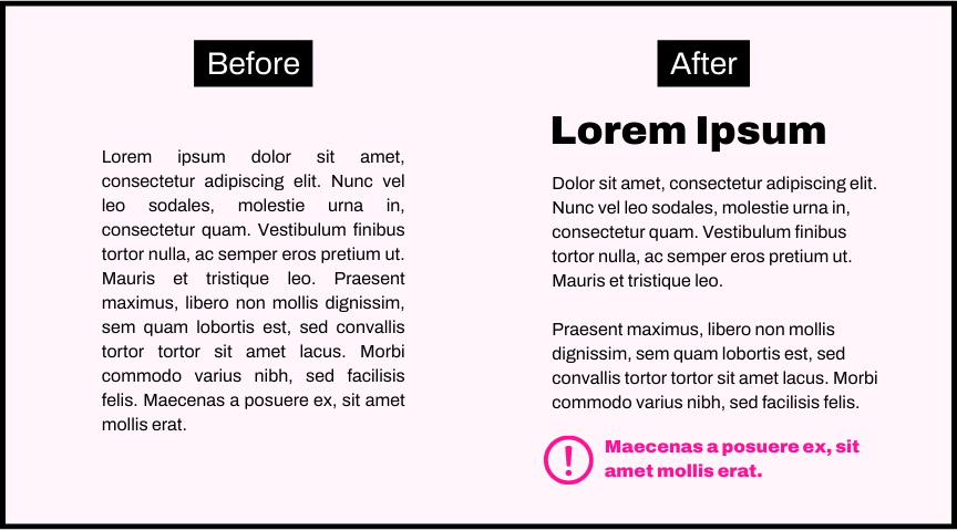
5. Avoid Giant Blocks of Text
Break up text visually into smaller chunks and use visual cues and headings to highlight important information. This is much easier to process, especially for those with ADHD or reading disabilities.
